Document Creation
Heading Structure
A logical heading structure enables screen readers to read documents and webpages. Use heading 1 for your main page title, heading 2 for sections of the page, and heading 3 for subsections that break the second level section down further.
- Use built-in heading styles in your document/webpage.
- Make sure that your document/webpage only has one Header 1.
- Do NOT skip heading levels - never jump from H1 to H3, H2 to H4, etc.
Alternative Text (Alt text)
Alt text is a description of an image that a screen reader reads to describe the picture to the user. Without alt text, screen reader users just hear "Image."
- Include alt text with all visuals.

- Alt text describes contents literally, so don’t include “Image of,” “Picture of,” etc. at the beginning of your alt text.
- Bad alt text: “Picture of Powell library.”
- Good alt text: “Crowds of people visit booths and walk around outside Powell Library on Bruin Day."
- Word and Powerpoint have the option to mark images as decorative, but we do not recommend that you use this marker. If images bring no new information to the page, describe the images as decorative in the alt text.

- The UCLA logo to the right is not a decorative image. Appropriate alt text would be "UCLA Logo."
- The line divider to the right is purely decorative, so appropriate alt text would be “Decorative line divider.”

Descriptive Hyperlinks
Screen readers can scan for links and create a list of links, so informative link text is helpful. Links in digital documents/pages should convey clear and accurate information about the destination.
- Unless printing a document for physical distribution, use the full title of the linked page as the linked text.*
- Do NOT link pages with text such as “Click here”.
- Good practice: UCLA Disabilities and Computing Program
- Bad practice*: https://dcp.ucla.edu/
- Bad practice: Click here
- Use unique link text for unique links. If you want to link out the same page more than once, use the same hyperlink text.
* If intending to print a document or PDF, then it is better to have the full hyperlink in printed versions of a document.
Color Contrast
Appropriate color contrast between a document’s text and background makes the content more accessible to people with different visual impairments. WCAG 2.0 AA guidelines recommend a minimum ratio of 4.5:1 for large text and 3:1 for other text and images.
- Visually check your document for text that’s hard to distinguish from the background.
- To formally check color contrast, use the WebAIM Contrast Checker. You can also refer to our guide on Checking Color Contrast for extensive instructions.
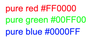
- Please note that on a white background, pure red #FF0000 and pure green #00FF00 are inaccessible.
- On a white background, pure blue #0000FF is accessible.
- If you are creating charts or graphs, refer to the “Graphs, Data Visualizations, and Infographics” section of our Faculty Resources page for further guidance.
Dyslexic Friendly Fonts
Using dyslexic friendly fonts improves readability for users. These sans serif fonts are also better recognized by Adobe’s optical character recognition (OCR) technology. Examples below:
- Most accessible fonts: Arial, Times New Roman, Verdana, Tahoma, Century Gothic, Trebuchet, Calibri, Open Sans.
- Fonts to avoid: Times New Roman Italicized, Curlz MT, Abadi MT
Document Distribution
We recommend that you distribute PDF versions of your Powerpoint and Word documents per our Building an Accessible Course guide, and that you use descriptive yet concise file names.
Accessible Course Development
For foundational guidance on building an accessible course that applies to all types of courses, please refer to our guide on Building an Accessible Course.
If your course materials contain special content (mathematical equations, programming, graphs, etc.), please refer to our Additional Topics for Accessibility section on the Faculty Resources page for accessibility guidelines.