1. Provide meaningful alternative text (“alt text”) for images
Alt text should convey information that is equivalent to the meaning/content or purpose/function of the image. All images should therefore have an alt attribute provided in the source code.
The alt text should be as succinct as possible. For instance, if an image of an institute’s logo is provided on the website, the alt text should read simply the name of the institute, as this is the information that is critical to the user; not “logo”, “(institute)’s logo”, or a description of what’s happening in the logo (i.e. “logo showing bird flying over planet”). Generally, the words “image”, “graphic”, “photo”, etc. are not necessary or helpful. Limiting to 100 characters is a good rule-of-thumb.
If the image is a complex image, such as a chart, graph or diagram, then a longer description may be necessary and should be placed in the text content of the page near the image. For complex images, alt text isn’t sufficient information. Describe in the text of the page why the image is significant and what it demonstrates.
The alt attribute should also be included for images that are purely decorative. Here, the code should read: <alt=””>. The empty alt attribute cues screen-readers to skip the image when reading the website. Use of the empty alt attribute is appropriate when the alt text would simply be the same as text content near the image. Exception: if an image is the only thing within a link, then an empty alt attribute is not permissible.
Avoid using images of text. Screen-reading software cannot interpret these images unless alt text is included. Low vision users may wish to enlarge text, change the text color, etc. If textual information is fixed in an image, users cannot manipulate the text to suit their needs. Text should only be used in an image if a particular style of text is integral to the information conveyed on the website and it cannot be achieved using normal text elements.
Context is king in choosing the most appropriate alt text.
2. Use headings to organize and structure content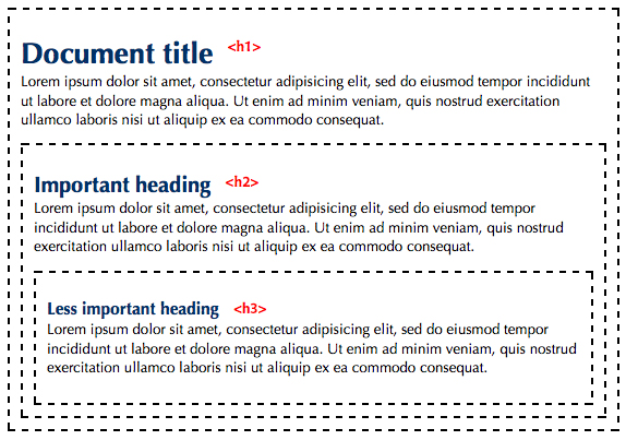
Break content into sections with understandable headings to ensure that all users will find the information they need. Use the h1-h6 elements as you would in an outline. Use <h1> for your main page title. Use <h2> for sections of the page. If you break a second level section down further, use <h3> headings for the sub-sections, and so on. Each heading and sub-heading should be visually distinguishable from the main text (usually accomplished via CSS with larger font sizes or other style effects), and this method of organization should be consistent between all pages of the site. Headings and sub-headings should be clearly defined as such in the source code (h1, h2, h3, etc), as screen-readers rely on this identification in order to scan through the major sections and contents of each page. Use good judgment on what is and is not a heading. It’s possible to use headings too much. If you have more content marked as headings than as normal text, then you should rethink your structure.
When emphasizing text, setting the text off in a different color is not sufficient. Use the structural elements of <em> for emphasis or <strong> for strong emphasis. By default, these elements render as italics and bold respectively, but that can be controlled with CSS.
It is also important that users understand where they are in relation to the site hierarchy at all times. Breadcrumbs and extendable navigation menus can be helpful in ensuring that users understand their location within the site.
3. Use descriptive link text
Use language that describes where the link goes. Do not use “click here”, “here”, “link”, “article”, “on this page”, “read more”, or similarly vague text. Ideally, the purpose of each link can be determined from the link text alone.
Avoid using the same text for links that go to different locations. Keep link text short and precise. Lengthy descriptions make it difficult to understand where your link goes. For example, don’t turn whole paragraphs into links – select a few words that, even when taken out of context, best describe your link.
Link Text Resources
- Why Your Links Should Never Say “Click Here” – Smashing Magazine
- Don’t use click here as link text – W3C Quality Assurance Tips for Webmasters
4. Provide captions, transcripts, and audio description for media
- Provide synchronized captions for all video content with synchronized audio.
- Provide transcripts for all audio and video content.
- Provide audio descriptions for video content.
Captions are intended for users with permanent or temporary hearing impairments as well as for users watching video content in an environment where surrounding noise makes hearing difficult. Audio description is intended for users with visual impairments who cannot see the visual content of the video.
If you are using an automated captioning method such as YouTube captions, review and edit the captions for accuracy. Automated captioning usually results in errors in the caption output.
5. Ensure users have the ability to pause audio and video content
Audio and visual activity on a website can be distracting for many users. If the site includes visual action (such as a slideshow or carousel of rotating images or other animated content) or audio content that starts automatically and last longer than five seconds, users must be given the option to pause/turn off this action.
6. Ensure colors meet minimum contrast ratios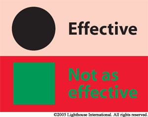
It is imperative that viewers can easily distinguish text from the background. Make sure you choose a foreground/background color combination that has a sufficiently high contrast ratio to meet the minimum requirement. For text displayed in less than 18 point (24 pixel) font, the contrast ratio between text color and background color should be at least 4.5:1. For text that appears in 18 point (24 pixel) font and above, the minimum contrast ratio is 3:1. Test your color contrast choices using a color contrast checking tool.
If you are styling links without underline text decoration, then there must also be a 3:1 contrast ratio or better between the link text and the surrounding unlinked text.
Ideally, avoid putting text on busy background images. Logos are exempt from color contrast ratio requirements.
In addition to choosing a high-contrast foreground/background color combination, optimize text legibility by avoiding the use of justified text and very small text (under 9 point).
7. Do not rely on color alone as indicator of possible action or importance
The classic example is a green button for “go” and a red button for “stop.” However, a colorblind individual may not be able to distinguish the buttons, and a screen reader can’t interpret the colors. To remedy this situation, use shapes or text to distinguish buttons, and provide alt text that can be read by the screen reader when using icons or images.
8. Ensure users can extend or manipulate time limits
For elements of the website that include a timed component, users must be provided with a way of manipulating the amount of time provided, such as turning on/off the time limit before encountering it, or extending the time period when time is up. Some disabled users may need more time to navigate and access the material. Ensure there will be an option to extend time limits.
9. Use correct table markup
Screen readers read tables row by row. Provide table headers to correctly mark up tables.
10. Ensure all interactive elements can be used without a mouse
Many users with disabilities have access to only a single method of input/content access, most often a keyboard or a keyboard like device. Navigating a website should be device-independent; that is, a user should not be forced to use a specific device to navigate a website. The most common form of this is navigation menus that popup submenus when a mouse hovers over a certain item. Users who cannot use a mouse will not be able to then access specific pages in those submenus. Websites should accommodate device-independent navigation by allowing users to access content through various methods of input. In particular, hover effects should have a corresponding focus effect and vice-versa.
All objects that have a function on hover, should provide the same function on focus. When an object has focus there should be a clear visible indicator so that the user knows which object has focus at any moment.