Most people are familiar with forms of physical accessibility, like braille for blind people or ramps for wheelchair users, which are quite visible and common in the world now. However, the idea of “Digital Accessibility” is something you might not have heard of, or even thought of, just because it is so much less visible. But think about it, how many websites or digital documents or different websites do you view in a day? Someone needs to make sure they are all accessible to anyone, no matter the ability.
But before we get started on PDF accessibility, I have a few recommendations to make sure that information you might be sharing over the internet is as accessible as possible:
Recommendations
- If your PDF is a flyer or very heavily graphic, please consider making an accessible version outside of the flyer, as these kinds of documents are not very easily made accessible as a normal PDF.
- If you have the source file (Word Document, HTML webpage, PowerPoint presentation), please consider providing it as well. These kinds of source files will often be much more accessible than the PDFs you create from them.
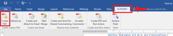
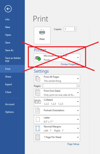
- When you create a PDF from one of the Microsoft Office tools, please try to export the document as a “tagged” PDF, as opposed to “Printing as PDF”. Printing as PDF strips out lots of the information needed to make a PDF accessible, whereas exporting as a tagged PDF will preserve this information. To do this, click the “ACROBAT” tab on the top ribbon, then the Create PDF button to export directly as PDF:
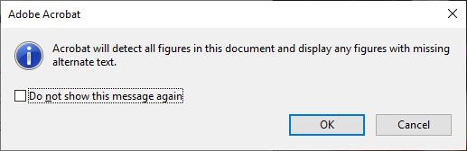
Do NOT use this:
Why Make PDFs Accessible?
While digital accessibility can encompass a lot, in this guide we’re focusing on PDF documents.
Thanks to its huge popularity nowadays, PDFs are by far the most common type of file in the world. Due to their portability across many different platforms, they are the go-to format for distributing important documents, especially in a university environment where you will need to look at things like prices for insurance or readings for your classes. And think about it; at UCLA alone, I would estimate around a couple hundred PDFs are created each day, and I would again estimate that to a first order, zero of them are made accessibly. This is a bit unfortunate because putting in only a few minutes can get most simple documents 80% of the way there.
Alright, but what exactly does it mean to make a PDF accessible?
Imagine if I show you this article.
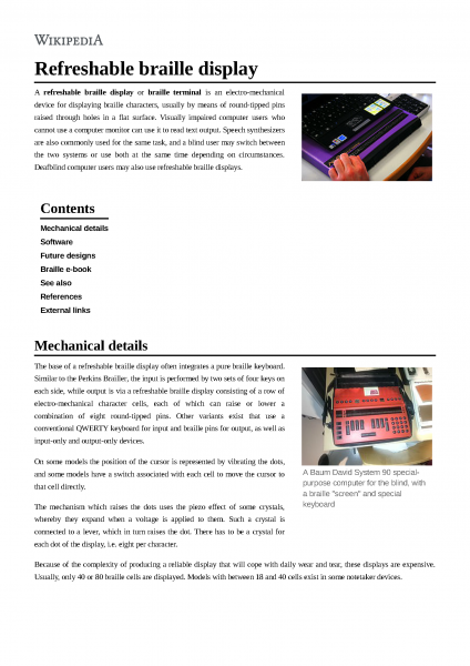
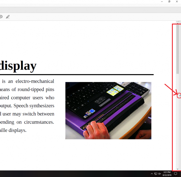
If I asked you what the title was, the answer would probably be easy if you aren’t blind: it’s “Refreshable braille display”. We know that because that title text stands out from the rest as being bold and bigger and near the top above everything else. We rely on visual cues from the text such as size and position to show what kind of text is a section heading, regular text, captions, or anything really.
However, now imagine if I show the same article to you like this;
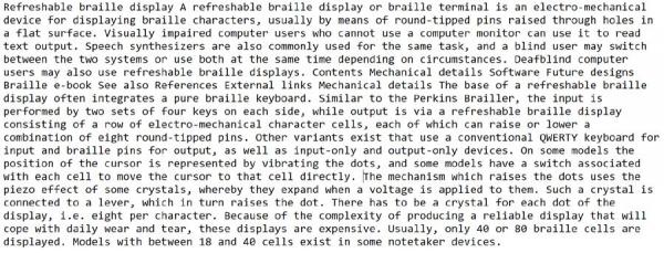
Can you still identify the title and section headings? Probably not, right? Same exact text, pulled directly from the article, but that’s it. Just text. Without any formatting, there is no way to distinguish what is a title, a section header, or normal text. Worse still, you miss all the images, which could be even more important than the ones on this particular article.
This is a good representation of a screen reader trying to read this document in an untagged state. Without telling the computer which pieces of text are what types of content, the computer doesn’t know any better than to just read everything off as plain text, making the article that much harder to comprehend and navigate.
This is our job; to put in these tags so that screen readers can say that this text is a header or part of a table for example.
Now that you know why we are doing this, let’s actually dive into the process. In this guide, I will be showing the most basic, but by far easiest and quickest way to make a PDF accessible using Adobe’s Accessibility Wizard.
Step 1 – Opening the Wizard
Acrobat’s Action Wizards are simply collections of different actions for achieving a certain goal, like to make a document accessible. It runs all these actions one after another, holding your hand all the way, so it usually only takes a few minutes.
To open the wizard:
- Make sure the tab on the right hand side is open (click the tiny arrow on the right if it’s not)
- Now that you opened this Tools menu on the right, search “Action Wizard” in the search box near the top.
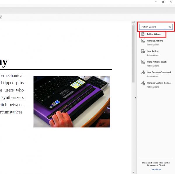
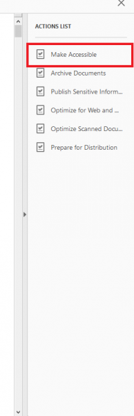
- Click on the prebuilt “Make Accessible” action wizard
- Click the blue “start” button on the right side.
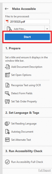
Then, Adobe will start running you through all the little steps listed to make the document more accessible.
Step 2 – Running the Wizard
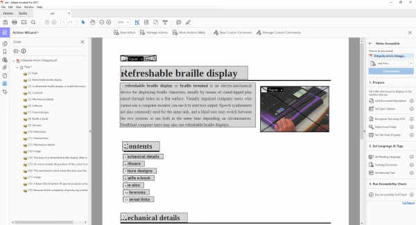
After you press start, this will be the first box that pops up.
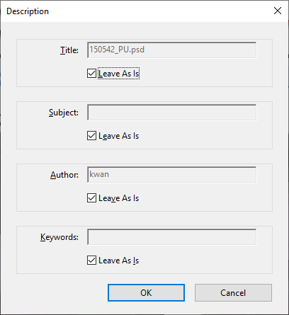
First, Acrobat will ask you for a title. This is metadata about the document so that a user can get an idea about what the content is about.
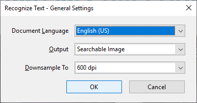
Next, it’ll ask you to “Recognize Text”. This performs what is called “OCR” (Optical Character Recognition) on a scanned document so that image only scanned documents can have images of text be turned into real highlight-able text. This allows the screenreaders and other software to know what text it should be reading.
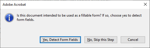
If your PDF is indeed meant to be a form, you should click “yes”. Otherwise, click “no”.
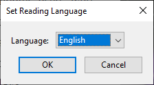
Next, it’ll ask you to set what is called the “reading language”. This will tell a screen reader which language it should be reading in.
This is the first part where we’ll actually have to do some work. Acrobat will ask you to fill in what is called “alternative text (or alt text)” for all the pictures in the document. Alternative text is simply a description of an image that a screen reader can read to tell its user what they should know about the picture. For example,

I could make the alternative text for this particular image be “Festivities at UCLA on Bruin Day”.
Back to Acrobat,
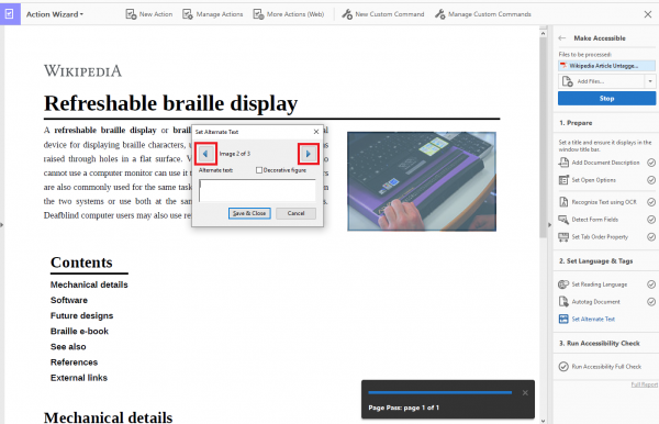
this interface will appear for alternative text. By clicking the arrows in the top left of the little window, you can cycle through all the figures in the entire document. The individual picture in question will have a sort of blue filter placed over it to indicate for which picture you will be writing the alt text.
Also, notice the “Decorative figure” check box. You can check on a certain picture to skip the alt text that doesn’t add any real meaning, and is just meant to be for decoration.
Finally, Acrobat will ask you to run the Full Accessibility Check.
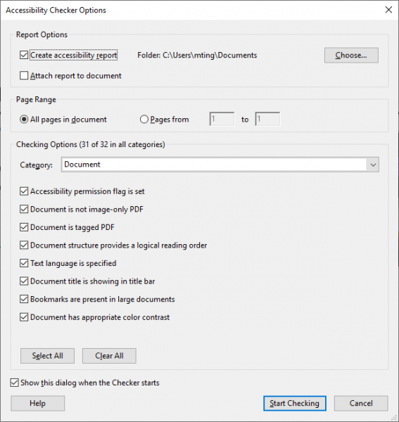
Just press the “Start Checking” button to start the process.
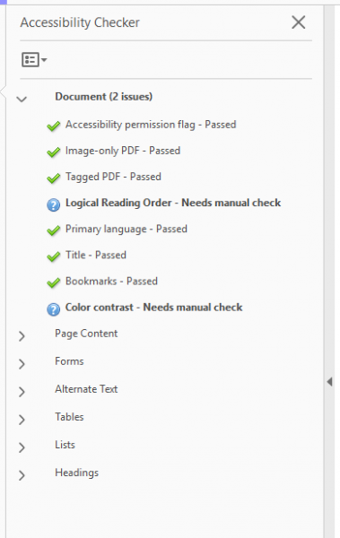
I don’t have very many issues, only ones that say “needs manual check”. If there are issues that do not say that, simply right click the issues and click “Fix”, and Acrobat will show you exactly how to resolve the issue.
(Optional) Manual Check
I understand that many of you who might be reading this do not have the time to perfect every single document that you work on, so I’m labeling the section as “optional” because the document is already in pretty good shape by now. But here’s if you want to go the extra mile.
In the picture above, I only have 2 issues left, but they both require a manual check. These are:
- Logical Reading Order
- Color Contrast
Logical Reading Order
Behind the scenes, Acrobat puts separate content into “block”, like each paragraph or each picture. The reading order puts numbers on each block to tell a screen reader in what order it should try to read the blocks of content.
Now of course, the computer will try to do its best to infer what logical reading order might be, but only a human can give the final pass on whether the reader order makes sense.
So how can we see this reading order, and the blocks of content? Right click on the very left (on an empty space in the column where you see the icons of a paper clip and a little stick figure with a check). This will bring up a drop down menu where you can see an option to open the “Order”, which is represented by an icon with 4 squares, and a “Z” connecting them.
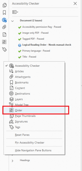
Click “Order” to open the reading order panel.
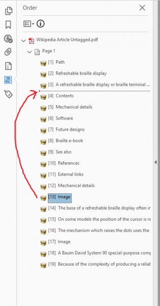
Here, you can see the blocks of content, as well as in which order they are being read, which is indicated by the little number in the top left of each box.
Now everything looks mostly fine here, except for one thing: shouldn’t the picture of the purple braille display, right below the title line, be read right after the introductory paragraph? Right now, its actually being read 13th, which is after the “Mechanical details” heading, which doesn’t make much sense.
To fix reading order, all we have to do is find the block of content on the left side, and drag it into the right place. So what was 13th, I believe should be moved to between 3rd and 4th.
And after dragging,
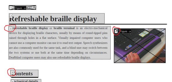
So now everything is in its proper place.
I understand that in longer documents, this process can take a very very long time, which is why I put this under the “optional” section. Even still, especially if the document is not so long, please try to do this. Imagine trying to read a newspaper, but every paragraph was out of order: that’s what trying to access a PDF without proper reading order might feel like for a screen reader user.
Color Contrast
Color contrast is important so that people who have a harder time making out colors can actually read the document properly. This applies both to text and The WCAG (Web Content Accessibility Guidelines, an international standard on digital accessibility,) states certain color contrast ratio requirements.
There are several online tools you can use to check if your contest has enough contrast to meet the WCAG standards.
The reason I put this issue in the optional section is because it’s hard to fix inaccessible color contrast when you’re just in a PDF document, it’s much easier to edit it in the source file. However, if you ONLY have the PDF (no source), and there’s not an easy way to change a certain color (text on an image, graphical icons), but the information is vital to convey, we recommend finding a separate way to convey the information, like maybe in a separate word document that has only text.